Unlock the full potential of your Gravity Forms date fields. Date Formats is designed to offer fine-tuned control over date formatting. Seamlessly customize date formats and configure datepicker styling options to suit your specific needs, ensuring a polished and consistent user experience. Elevate your form aesthetics and functionality.
- Customize date formats for any date field.
- Configure datepicker options for a tailored user interface.
- Enhance user experience with intuitive date selection.
- Send data to third-party services as they expect receive it.
Date Formats

“The Date Formats plugin was exactly what we needed to send dates in a specific format to our third-party service. Its seamless customization options have made our integration process smooth and efficient!”
Disclosure: This testimonial provided by AI. Do your part to fight the machines by submitting a testimonial of your own.
Documentation
Date Formats
Field Settings
General
These settings can be set from within the Field Settings → General for any standard Date field.
| Setting | Description |
|---|---|
| Hide Day of Month Input | This setting allows you to hide the day of month input when rendering the form, so that only month and year need be provided. Note: day of month will still be recorded defaulting to 1. |
| Enable custom date format | This setting includes a tick box to indicate whether a custom format should be applied to the field. This format will be used for datepicker field display, merge tags, feeds, exports, and entry screens. |
| Custom Date Format | Set the date format to be used for the field. Accepts a selection of PHP DateTime characters. |
Allowable Characters
| Character | Description | Example |
|---|---|---|
d | day of month (w/ leading zero) | 03 |
j | day of month | 3 |
z | day of year (starting from 0) | 42 |
D | day of week (three letters) | Tue |
l | day of week (full) | Tuesday |
m | numeric month (w/ leading zero) | 08 |
n | numeric month | 8 |
M | month name (three letters) | Aug |
F | month name | August |
y | year (two-digit) | 04 |
Y | year (four-digit) | 2004 |
U | unix timestamp (start of day) | 1739477653 |
Appearance
The following display options can be set within Field Settings → General for any Date field of the type Datepicker.
| Setting | Description |
|---|---|
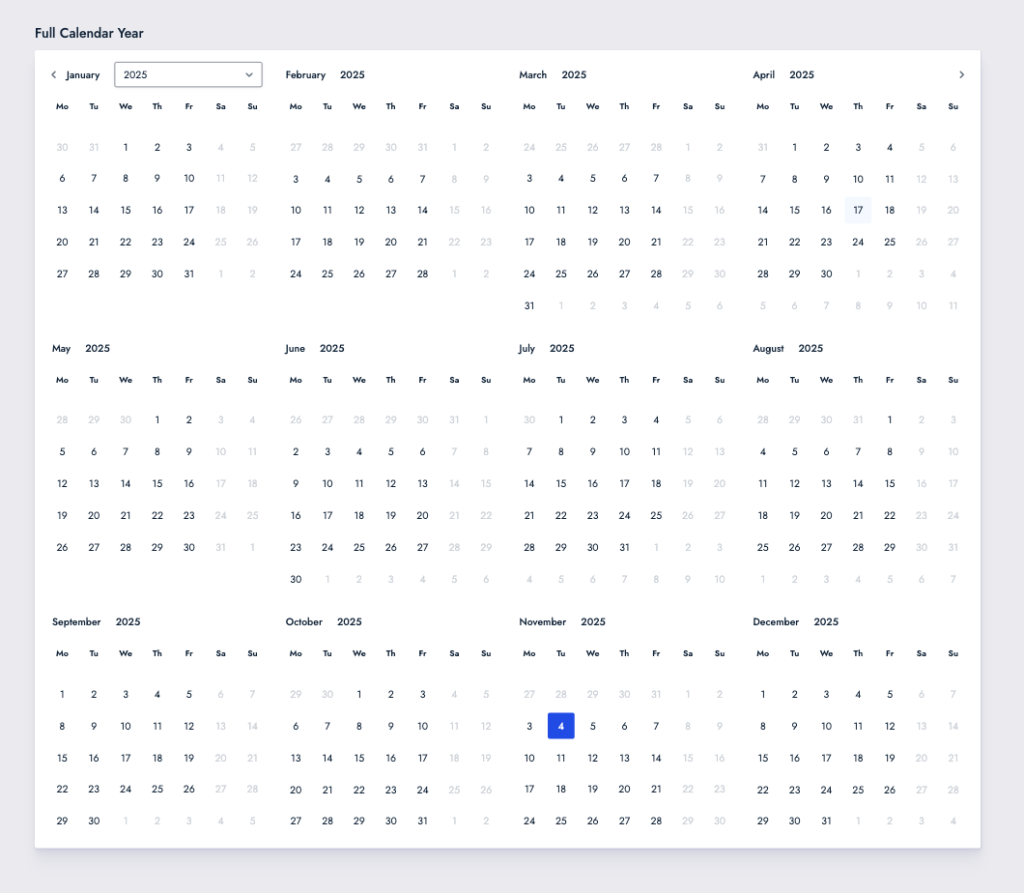
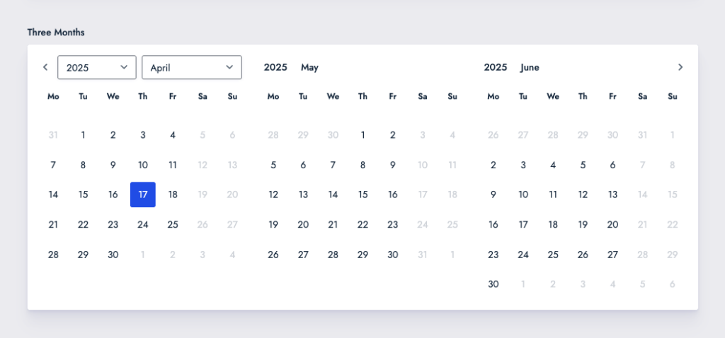
| Layout of Datepicker Months | Set layout for months in the datepicker. Options include single month (default) and grids of 1×2, 1×3, 2×2, 2×3, and 3×4. |
| Disable year dropdown | Only show year. Selection must be made by navigating the datepicker. |
| Disable month dropdown | Only show month. Selection must be made by navigating the datepicker. |
| Hide dates from surrounding months | Dates from the previous and next month will not be visible when viewing current month. |
| Allow selection of dates from surrounding months | Allow dates from previous and next month to be selected without first navigating to that month. |
| Show month after year | Switch the default order of month/year dropdowns in datepicker. |
Layout Examples
Three Months
Full Calendar Year
When used in tandem with the inline datepicker available in GP Limit Dates, the 3×4 grid layout feature allows direct presentation of a full year calendar.